
SEO Analytics Dashboard: What to Track and Why
Learn what an SEO analytics dashboard should track, which GEO metrics matter in 2026, and how AI-driven platforms like Wispra improve visibility.
You open your reporting tool on a Tuesday morning and get hit with a wall of charts. Rankings. Clicks. Impressions. Session metrics. Technical warnings. Maybe a map pack panel. Maybe a separate tab for AI search mentions. You know the data matters. You just can't tell which number deserves your attention first.
That's where many go wrong with an SEO analytics dashboard. They treat it like a storage cupboard for every available metric, when it should behave more like the instrument panel in a car. You don't need to see every component of the engine at once. You need a few signals that tell you whether you're moving, whether you're drifting off course, and whether something under the bonnet needs fixing.
That matters even more in France. Google still concentrates most search demand, holding roughly 92% of the search market, and organic search accounts for about 53% of web traffic on average, while the top three Google results capture about 50% of clicks combined and position one gets around 27% according to France SEO statistics. For a business owner, that makes dashboard clarity more than a reporting preference. It affects where you spend time, budget, and editorial effort.
What an SEO Analytics Dashboard Really Does
An SEO analytics dashboard is the working screen you check before deciding where to spend the next hour.
If you open Search Console, GA4, a rank tracker, and a crawler in separate tabs, you can find the truth. It just takes too long. A dashboard brings the signals together so you can answer one practical question faster: what changed, and does it need action?
That matters more in 2026 than it did a few years ago. In France, search visibility no longer means only blue links and clicks. AI Overviews already appear on a large share of tracked searches, so a dashboard that reports rankings alone can look tidy while missing part of your real search presence. If your brand is cited in AI answers but clicks fall, the story is different from a simple ranking drop. If neither citations nor clicks appear, the problem is different again.
A useful dashboard answers three questions quickly:
- Are we being seen? This includes standard organic listings, local results, and AI-generated answer surfaces.
- Are we getting business value from that visibility? Visits, leads, revenue, and qualified actions matter more than raw traffic.
- Is anything blocking performance? Indexing problems, template changes, page speed issues, or broken internal links can hide behind stable rankings for a while.
The car-dashboard comparison still fits. You glance at speed, fuel, and warning lights first because those readings affect the next decision. SEO works the same way. You should be able to tell whether a category page in Lille lost impressions, whether a location page in Marseille stopped appearing in local results, or whether an AI answer now cites competitors instead of your site.
For first-time users, the common mistake is treating the dashboard like an archive of every metric a tool can export. That creates noise. A dashboard should reduce hesitation.
In practice, that means combining a few sources into one view:
- Search visibility data from Google Search Console and rank tracking tools
- On-site outcome data from GA4, your CRM, or lead tracking
- Technical and AI-search signals from crawlers, citation monitoring, and GEO-focused tools such as Wispra
Put together, those layers show cause and effect. A drop in clicks might come from weaker rankings. It might also come from stronger AI answer coverage that satisfies the query before the click. A rise in impressions with no lift in leads may point to mismatched intent, not success.
One rule helps keep the screen clean. If a metric does not support a decision, move it off the main view.
Some teams also need to connect SEO activity to pipeline and revenue, not just visibility. A tool built as a dashboard for ROI measurement can help structure reporting around outcomes, especially when stakeholders care more about booked demos or sales than position changes.
The job of an SEO analytics dashboard, then, is not to display everything. It is to help you spot movement, judge whether that movement matters, and choose the next action with confidence. In France, that now means measuring both classic SEO performance and the newer GEO signals that show whether AI systems are using your content at all.
Core Metrics Every SEO Dashboard Should Track
A useful dashboard answers a simple weekly question: are more of the right people finding us, getting what they need, and turning into leads or sales?
That is why I group the main metrics into three buckets: visibility, engagement, and technical health. It works like a funnel with a diagnostic layer underneath it. Visibility shows whether you appear. Engagement shows whether the visit had value. Technical health explains why a good page can still underperform.
Visibility metrics
Visibility metrics measure reach, but they only matter when tied to pages and queries you care about.
Track:
- Organic impressions
- Average position
- Indexed pages
- Share of voice for target queries
- Local-pack impressions and Google Business Profile interactions for location-based businesses
A simple example helps here. If your service pages in Toulouse and Marseille gain impressions, but your product pages for high-intent non-brand queries stay flat, your dashboard should not celebrate the total. It should show where visibility improved and where it did not.
France adds one practical wrinkle. For many businesses, Google still dominates organic discovery, so dashboard coverage often starts there. For local companies, map results can matter as much as standard listings. A dentist in Lille or a locksmith in Bordeaux may win the searcher's attention from the local pack before a blue link gets seen.
Engagement metrics
Traffic is only useful if it matches intent.
Watch for:
- Organic click-through rate
- Engaged sessions from organic
- Landing-page bounce patterns
- Conversion rate from organic
- Top landing pages by business value
These numbers help you separate surface-level visibility from useful visits. A page ranking in position 3 can still be weak if the snippet promises one thing and the page delivers another. The opposite also happens. A page in a modest position can produce strong leads because it answers a narrow commercial question well.
That is why engaged sessions need a clear definition. In GA4, an engaged session usually means the visit lasted long enough, triggered a conversion event, or included multiple page views. On an educational article, you want that trend rising over time. On a service page, a lower session depth can still be fine if contact form submissions increase.
A ranking chart can flatter a team. A conversion chart forces honest decisions.
If you want a wider framework for selecting those measures, this guide to SEO KPIs in 2026 is a useful companion.
Technical health metrics
Technical metrics belong on the main dashboard because they explain losses before revenue feels the impact.
Include:
- Crawl errors
- Core Web Vitals status
- HTTPS coverage
- Canonicalisation issues
- Index coverage changes
- Mobile usability warnings
Keep this section focused. You do not need every crawler export on the front screen. You do need fast warning signs. If a template change creates canonical conflicts on your money pages, or if a batch of pages drops out of the index, that belongs in the same view as your traffic and lead trends.
This matters even more in 2026 because classic SEO metrics can look stable while discoverability shifts elsewhere. A page with healthy rankings but poor rendering, weak structure, or indexing issues is less likely to be reused cleanly in AI-generated answers later. The dashboard should help you catch those blockers early.
Core SEO Metrics by Category
| Category | Key Metric | What It Tells You | Target Benchmark |
|---|---|---|---|
| Visibility | Organic impressions | Whether priority pages appear more or less often for relevant searches | Trend should be stable or improving for priority pages |
| Visibility | Average position | Whether tracked queries are gaining or losing prominence in results | Review as a trend over several weeks |
| Visibility | Indexed pages | Whether key pages remain eligible to appear in search | Important pages should stay indexed consistently |
| Visibility | Local-pack visibility | Whether local intent searches surface your business presence | Should match your service area priorities |
| Engagement | Organic CTR | Whether your snippet earns clicks when it appears | Compare by page type and query intent |
| Engagement | Engaged sessions | Whether organic visitors interact with the site | Should rise on pages meant to educate or convert |
| Engagement | Conversion rate from organic | Whether organic traffic produces enquiries or sales | Track trend by page group and intent |
| Technical health | Crawl errors | Whether search engines hit broken paths or blocked resources | Priority errors should stay low and get fixed quickly |
| Technical health | Core Web Vitals status | Whether page experience may help or hurt visibility | Aim for passing status on priority templates |
| Technical health | Canonical issues | Whether duplicate or conflicting signals confuse indexing | Key pages should have clear canonical signals |
One reporting habit saves a lot of confusion. Read these metrics in trends and combinations, not one by one.
If impressions dip for three days but indexed pages, rankings, and conversions hold steady, that is usually noise. If impressions fall on commercial pages, CTR drops, and crawl errors rise in the same week, you have a pattern worth investigating. That is the level a good dashboard should operate at. Not just what moved, but what moved together, and whether it affects the business.
GEO and AI Search Metrics Most Dashboards Miss
You open your dashboard on Monday and see a familiar warning sign. Organic CTR is down. In a 2022 report, that would usually point to weaker snippets, weaker rankings, or both. In 2026, especially in France, that reading is incomplete.
One reason is simple. Search visibility now often happens before the click. A study tracking 100,000 keywords across 20 niches in France found AI Overviews on 52.63% of searches, according to this France AI Overviews study. If your dashboard stops at rankings and sessions, it misses a large part of where discovery now happens.
A useful way to frame this is to treat classic SEO metrics as the shopfront and GEO metrics as the recommendations happening in the street outside. You still care about who walks in. You also need to know whether AI systems are mentioning your brand, citing your pages, or skipping you entirely.
The missing metrics
A dashboard built for 2026 needs a GEO layer next to standard SEO reporting. For French search in particular, that means tracking whether your content is being surfaced inside AI-generated answers, not only whether it ranks in ten blue links.
That layer usually includes:
- AI Overview appearance rate
- Citation count inside AI answers
- Brand mention share across assistant responses
- Page inclusion rate
- Zero-click visibility notes
- Prompt-level source attribution by domain
These metrics answer different questions than rankings do. Rankings tell you where you stand in a results page. GEO metrics show whether AI systems consider your page useful enough to quote, summarise, or cite.
That distinction matters. An informational page can lose some clicks and still gain influence if it appears more often inside AI responses during the research stage. For a French B2B brand or a local service company, that can shape brand recall well before a user is ready to visit the site.
How to read AI metrics without overreacting
Start with the query theme, not the raw drop.
If clicks fall on pages tied to informational searches, check five things in order:
- Did impressions fall as well?
- Did average position change in a meaningful way?
- Did AI answer presence increase for that query set?
- Is your site cited inside those answers?
- Are the cited URLs the pages you want surfaced?
That sequence prevents a common mistake. Analysts see lower CTR and assume loss, even when visibility has partly shifted into AI summaries.
You may also need to compare citation patterns by assistant and prompt type. Legal publishers, healthcare brands, and finance sites often see different citation behaviour depending on how specific the question is and whether the answer needs jurisdictional context. Teams that need to benchmark legal AI citations can use that kind of comparison to see which domains are repeatedly trusted as sources.
If GEO is still a new term for your team, this Generative Engine Optimisation definition and guide gives the background behind the measurement approach.
Where tools fit
Search Console, GA4, and rank trackers still cover the classic side of SEO well. They do not show, in any reliable way, how often your brand is cited in ChatGPT, Gemini, or Google AI Overviews across recurring prompts and themes.
Platforms such as Wispra fill that gap by tracking AI citations, brand mentions, and source-level visibility alongside standard search metrics. That makes the dashboard more useful for the way search now works in France. You are no longer measuring only who clicked. You are measuring who was seen, cited, and considered credible before the click even had a chance to happen.
Setting Up and Integrating Your SEO Dashboard
A French business owner opens a new dashboard on Monday morning and sees a tidy row of charts. Impressions look fine. Clicks look softer. Rankings have barely moved. Without the right setup underneath, that screen is decoration. With the right setup, it becomes a working control panel for classic SEO and for the newer question in 2026: are we being surfaced, cited, and trusted inside AI answers before anyone clicks?
Start with the measurement plan, not the design. A dashboard works like a cockpit. If the fuel gauge is missing, a polished map display does not help much.
The first job is to map your data sources to the decisions you need to make. For a France-focused setup, that usually means six inputs:
- Google Search Console for impressions, clicks, CTR, and average position
- GA4 for sessions, engagement, conversions, and page-level business outcomes
- A rank tracker for consistent keyword monitoring across target terms
- A site crawler for indexation, internal linking, status codes, and other technical blockers
- Google Business Profile for local discovery signals
- An AI citation tracker such as Wispra for visibility in AI Overviews, ChatGPT, Gemini, and related GEO workflows
That order matters because each source answers a different question. Search Console shows whether Google exposed the page. GA4 shows what happened after a visit. The crawler explains whether a technical fault is suppressing performance. Local data matters more than many teams expect for service businesses in cities such as Lyon, Marseille, or Toulouse. AI citation data fills the gap left by standard analytics, especially in France, where search visibility now includes answer surfaces that may never send a click.
Keep the first screen simple. A first-time user should understand the state of performance in about two minutes, without opening five tabs or decoding internal shorthand.
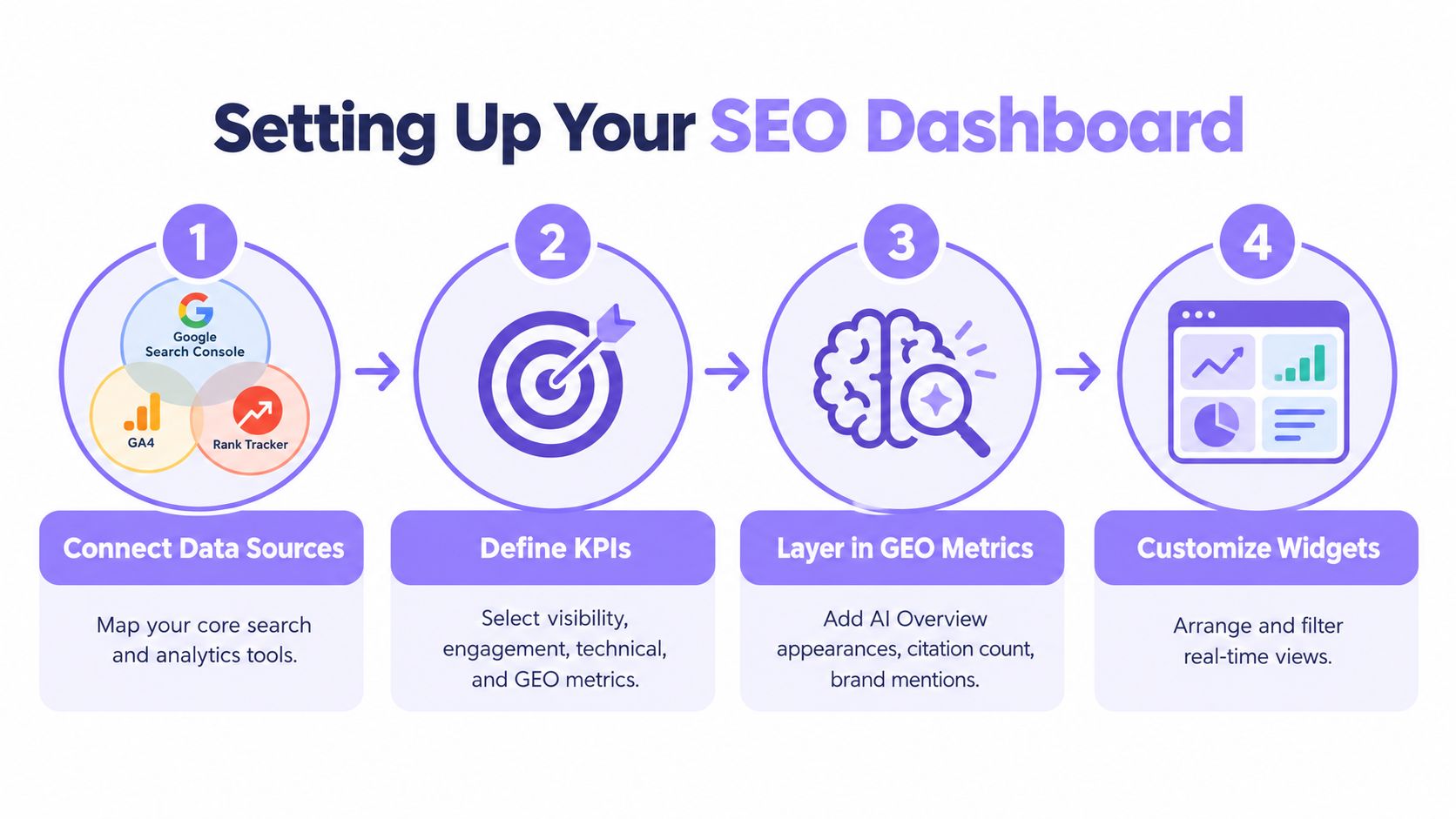
A practical layout usually follows this sequence:
Connect the core platforms first
Search Console and GA4 come first because nearly every weekly review starts there.Prefer native connectors
They reduce breakage, mismatched fields, and avoidable maintenance.Add imported datasets only when they answer a real question
CSV uploads are fine for niche sources, but somebody has to own refreshes, naming rules, and version control.Name metrics the way a manager would ask for them
“Leads from organic service pages” is clearer than “SEO CVR cluster B.”Separate national and local views
A French SMB may need one summary for country-wide content and another for city-level demand, map visibility, and store or office locations.Add an AI visibility layer early
If your dashboard measures only clicks and rankings, it reflects how search worked a few years ago, not how search behaves now.
Search Console still matters, but it has reporting constraints once you want page groups, device splits, local patterns, and cleaner blended reporting. If your team keeps hitting those limits, review options that go beyond Google Search Console limits. If you are building the reporting layer in Looker Studio, this guide to Looker Studio training for data reporting in 2026 is a useful companion.
For French SMBs, a good minimum setup is straightforward: connect Search Console, GA4, Google Business Profile, a crawler, and one AI citation source before spending time on visual polish.
A final check helps prevent bad dashboard builds. Ask whether the setup can answer five plain-language questions without guesswork:
- Are we gaining or losing search visibility?
- Are organic visits producing enquiries, leads, or sales?
- Is a technical issue interfering with discovery or conversion?
- Are AI answers citing our brand or skipping us?
- Are local search surfaces carrying more weight than standard blue-link results for some services?
If the dashboard answers those clearly, it is ready for weekly use. If it cannot, add fewer charts and better inputs.
Reading the Numbers Week to Week
A weekly dashboard review works best when it follows the same path each time. Take a wedding venue in Lyon. The owner wants to know whether search demand is still turning into enquiries, whether local visibility is holding up, and whether AI answers are starting to intercept visits that used to become clicks.
That is the right mindset for 2026.
In France, a dashboard can no longer be read like a simple rankings report. Google can still send valuable traffic, but AI-generated answers and local search surfaces now change how that demand appears. A useful weekly review helps you separate three questions: are more people seeing you, are they still visiting you, and are AI or local interfaces absorbing part of that attention before the click happens.
Monday to Friday reading pattern
Start Monday with the widest view. Check impressions for your key page groups, such as venue pages, pricing pages, and event guides. If impressions rise, your visibility improved. That is your first clue, not your conclusion.
Tuesday is for clicks and query groups. If clicks are flat or down while impressions are up, do not rush to rewrite titles. First check which search themes moved. For a venue business, broad planning queries like guest capacity, wedding budget, or ceremony checklist often behave differently from high-intent searches like wedding venue Lyon or salle de mariage Lyon. The first group may now produce more AI summaries. The second may still drive direct visits, map views, or calls.
Wednesday is where newer dashboards earn their place. Review AI citation logs, answer appearances, and the pages referenced in those answers. A page can lose some clicks and still gain brand exposure if Google or another assistant keeps citing it. For French businesses, that matters because visibility is no longer confined to ten blue links. Tools such as Wispra make this easier to review because they put classic SEO signals and AI visibility in one reporting flow instead of forcing you to compare disconnected exports.
Thursday is the local-intent day. Compare Google Business Profile actions with local landing-page performance. If calls, direction requests, or profile views stay healthy while organic page CTR softens, search demand may still be converting through Maps and local panels rather than through a standard website session.
Friday is for risk control. Look at crawl summaries, indexing changes, and any new errors on pages that bring enquiries. You are not trying to run a full technical audit before the weekend. You are checking whether something small, like a noindex issue, a broken internal link, or a template problem, could become next week's traffic drop.
Weekly SEO Dashboard Reading Example Week
| Day | Metric Focus | Sample Number | Interpretation |
|---|---|---|---|
| Monday | Organic impressions trend | Higher than last week | Visibility improved, so demand or coverage may be rising |
| Tuesday | Organic clicks trend | Lower than last week | Needs query-level review before assuming performance dropped |
| Wednesday | AI citation presence | More cited answers than last week | Brand may be gaining exposure even if site visits are flatter |
| Thursday | Google Business Profile actions | Steady to improving | Local intent may still be converting outside standard webpage paths |
| Friday | Crawl summary | One new priority issue | Technical review needed before it affects key landing pages |
What the owner does with that information
The owner is not collecting trivia. Each reading should lead to a choice.
If impressions rise and clicks fall, the next step is to check whether the drop sits in informational queries, local queries, or a few specific pages. If AI citations are up at the same time, the business may need stronger on-page branding, clearer FAQs, and better conversion paths for the users who still do click through.
If Google Business Profile actions improve while local landing pages stall, the owner may decide to refresh business photos, tighten service descriptions, or align location-page messaging with what searchers see in Maps. If crawl warnings appear on revenue pages, the priority shifts from content work to fixing discovery and indexation.
A dashboard works like a weekly control panel. You do not stare at every dial equally. You check which signals changed, then inspect the system behind them.
Do not ask whether SEO is "good." Ask what changed, where it changed, and whether it affects enquiries, bookings, or brand visibility.
Read patterns, not single spikes
One soft day in clicks means very little. A repeated pattern across several weeks means something.
That is why the weekly habit matters. It slows down bad decisions. Many small business owners react too fast to a dip in CTR or a ranking change, then spend time editing pages that were not the problem in the first place.
Look for patterns like these:
- Rising impressions with flat clicks can point to AI-answer growth or weaker SERP click share
- Stable local actions with softer page traffic can mean Maps is carrying more of the conversion load
- Repeated crawl or indexing warnings often show up before the traffic loss becomes obvious
- More AI citations can signal growing visibility even before sessions or leads reflect it
The goal is simple. Your SEO analytics dashboard should help you decide what to do this week, while keeping one eye on how search in France is shifting from click-only reporting toward a mix of traffic, local action, and AI-mediated discovery.
Should You Still Optimise for Clicks in 2026?
A French business owner opens the dashboard on Monday and sees traffic down. The first reaction is usually, "SEO is slipping." In 2026, that reaction is often too narrow.
Clicks still matter. They matter a lot for pages that earn money only after a visit, such as product pages, quote forms, booking pages, and service pages with strong conversion paths. If the action happens on your site, sessions are still a working metric, not a vanity one.
The mistake is treating every drop in clicks as a loss in visibility.
In France, that matters more now because AI Overviews already appear on 52.63% of tracked searches. So a dashboard built only for rankings and CTR is measuring search the way it worked a few years ago, not the way it works now. A user may read an AI summary, notice your brand, remember your offer, and visit later through a branded search, Maps result, or direct visit. The classic click report will miss part of that journey.
Clicks still matter. They just do not answer every question.
Google Search Console still gives useful data on impressions, clicks, CTR, and average position, and Google Search Console's reporting context for search performance remains relevant for understanding what Google records and what it does not. But Search Console was built for classic search interactions. It is less helpful if your real question is, "Did we appear in the answer that shaped the searcher's decision before any click happened?"
That is the gap.
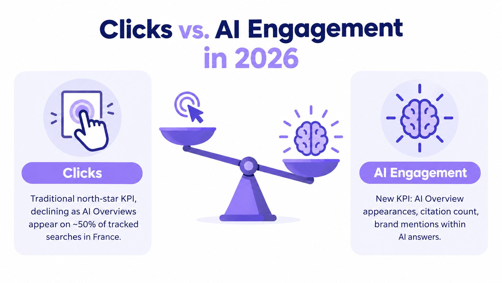
A practical way to read this is to split pages by job, not by template.
- Prioritise clicks for pages meant to produce on-site action, such as category pages, product pages, booking pages, lead forms, and high-intent service pages
- Prioritise citation and answer visibility for pages meant to shape awareness, trust, or early research, such as guides, explainers, comparison content, and topical authority pages
That split helps first-time dashboard users avoid a common mistake. They judge an informational article by the same standard as a money page. That is like judging a shop window by how many people paid at the till. The window's job is to get noticed and remembered. The till's job is to close the sale.
For GEO reporting, your dashboard should reflect that difference. If an educational page is cited in AI answers more often, branded search grows later, and assisted conversions rise, the page may be doing its job even with weaker CTR. A tool like Wispra is useful here because it can sit alongside classic SEO reporting and give you a cleaner view of whether your content is being used in AI-mediated discovery, not just clicked in ten blue links.
So, should you still optimise for clicks in 2026?
Yes, for pages where the visit creates value.
For the rest, optimise for the full chain of visibility. In France, that now includes classic rankings, local actions, branded demand, and AI citation presence. A good SEO analytics dashboard should help you tell those apart before you decide what to fix.
A Practical Action Plan and Where Wispra Fits
Teams that already have Search Console and GA4 in place usually do not need a full dashboard rebuild. They need to close one reporting gap, then turn that gap into a weekly habit.
A common France-based scenario looks like this. Your dashboard still reports rankings, clicks, and conversions clearly enough. But it cannot show whether an informational page is being cited in AI answers, whether a local service page is appearing in new search surfaces, or whether a drop in organic clicks reflects weaker visibility or a shift in how Google presents answers. In 2026, that blind spot matters more than another chart.
Start with a simple audit of the dashboard you already use. Put every metric into four groups: visibility, engagement, technical health, and AI or GEO visibility. If one group is empty, fix that first. If one group takes over the screen, trim it back so the dashboard answers one question well: where are we gaining attention, and on which surface?
Then choose three review metrics for the next month.
- One visibility metric such as impressions, ranking distribution, or local pack presence
- One outcome metric such as qualified conversions, assisted conversions, or leads from organic sessions
- One AI or GEO metric such as citation frequency, brand mentions in AI systems, or answer presence for your priority topics
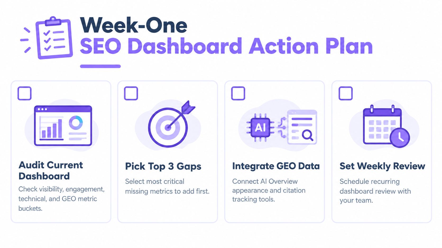
For a first pass, the workflow can stay small:
Audit the current view
Remove duplicate charts, vanity widgets, and anything no one uses in a decision.Name the biggest blind spot
For many teams in France, that is AI answer visibility, local intent shifts, or weak reporting on branded demand after informational content is discovered elsewhere.Add one missing data source
Keep the setup narrow. One new layer is easier to trust than five half-connected tools.Run a 20-minute weekly review
Write down three things each time: what changed, what probably caused it, and what the team will change this week.
Execution usually stalls after step two. The dashboard highlights a pattern, but no one owns the follow-up. That follow-up is often practical, not technical. Rewrite an FAQ so the answer is clearer. Add missing entity detail to a local page. Improve page structure so the main answer is easier to extract. Refresh a service page so its claims are specific enough to be cited accurately.
This short explainer is useful if you want a quick visual on the workflow side of modern search reporting:
Wispra fits at the point where classic SEO reporting stops. It tracks AI-driven visibility alongside your existing dashboard, including whether your brand is mentioned or cited across systems such as ChatGPT, Perplexity, Gemini, and Google AI surfaces. That gives analysts a missing layer. Instead of treating every click drop as a content failure, you can check whether discovery shifted to an answer surface where the brand is still present.
That distinction matters more now, especially for French businesses that publish both commercial and informational content. A booking page still needs visits and conversions. A guide page may create value earlier in the journey by earning citations, increasing branded recall, and supporting later assisted conversions. A useful dashboard should let you see both jobs without forcing them into the same success metric.
If your current reporting still shows rankings and clicks but can't tell you whether AI search engines are recommending your business, Wispra fills that gap. It helps you track AI visibility, brand mentions, and GEO performance alongside the SEO signals you already watch, so your dashboard reflects how people discover businesses now.